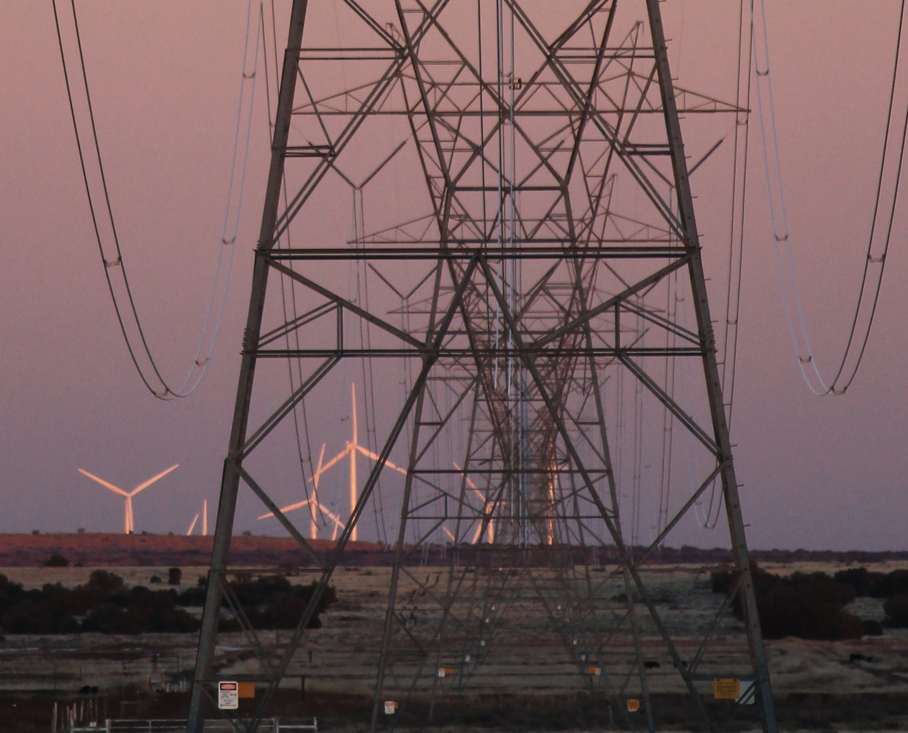
I’m working on something about the electrical grid in the West, and found this massive trove of data from the Energy Information Administration: A database showing exactly how much electricity every utility-scale power plant — from the massive Palo Verde nuke plant and Grand Coulee dam down to small wind farms — generated in 2016. I did some data wrangling and used Tableau to put together this visualization. Interesting stuff, if you’re a nerd, I guess. I’ve tried and failed to embed the viz into this post. So you’ll just have to click the link to play around with it.
The West’s juice generators, big and small


This info.definetle awake,s my interés y for educación & motivation
LikeLike